A refusal you can check.
When the documents can’t prove an answer, the desk still declines, and now shows the passages it weighed right beside the refusal.

Case studyProofdesk.the knowledge desk that refuses to guess
Proofdesk answers from a team’s own documents and declines what they can’t prove. Only its interface changed: it was rebuilt on Beamline UI.
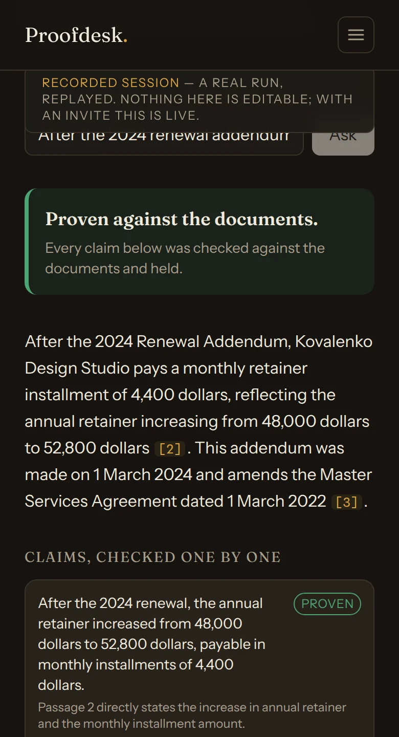
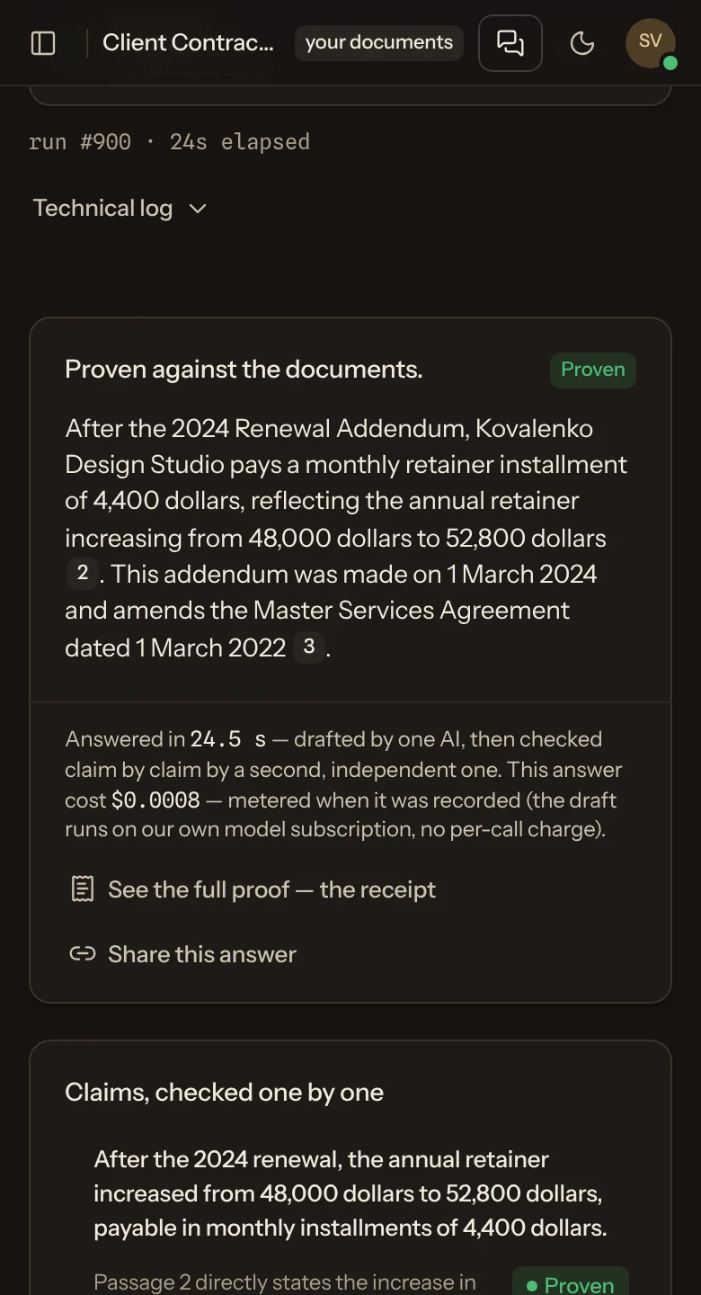
The same question in both, answered from the same documents.
From 42to 0
text-contrast failures
axe: front page, desk, account, in dark
From 96to 100
Lighthouse accessibility
front page; the desk went 96 → 99
From 93to 3
hand-built controls
counted in the interface source
From 1to 2
themes
light added to dark
Before: the original app, measured 10 Oct 2026. After: the live demo, measured 12 Oct 2026, in dark, the original’s only theme. axe-core 4.11 and Lighthouse 12.8, desktop at 1512×982. Automated checks, not a full accessibility audit.
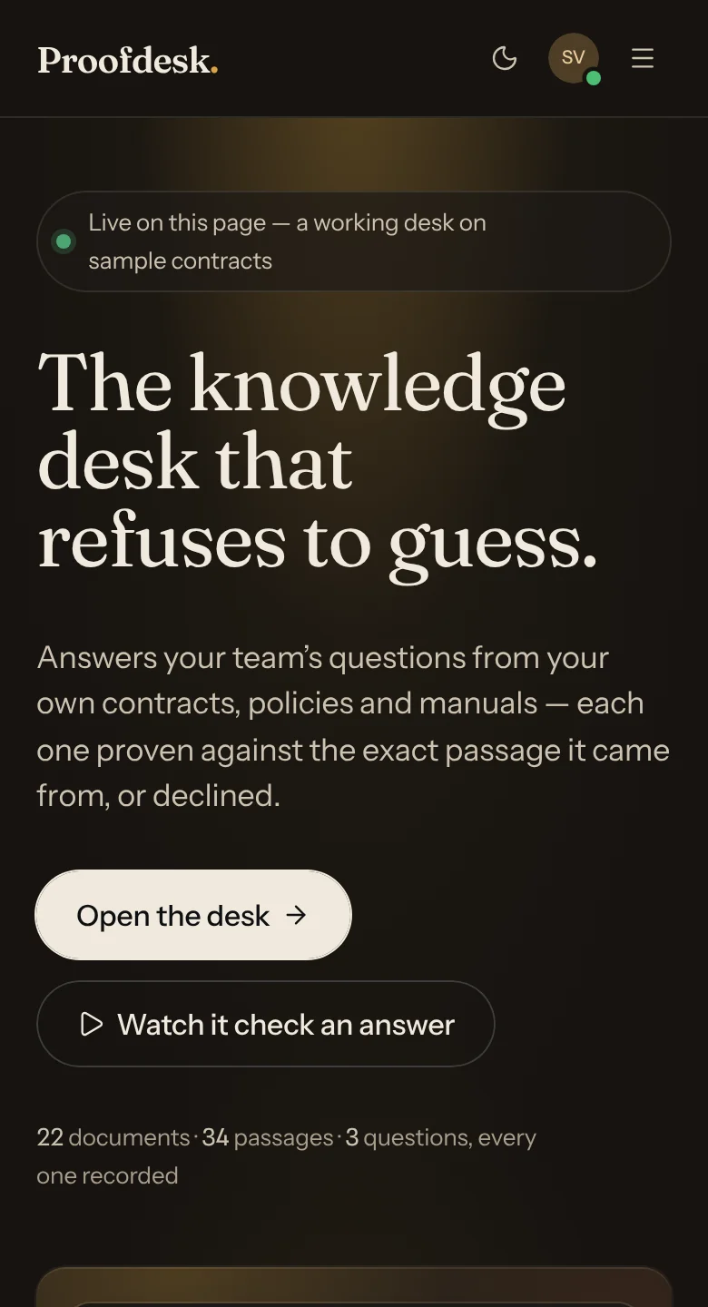
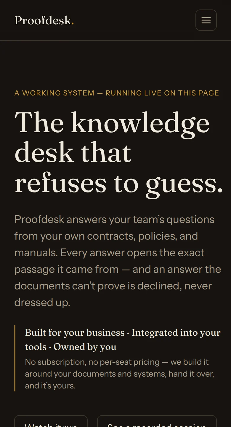
The front door
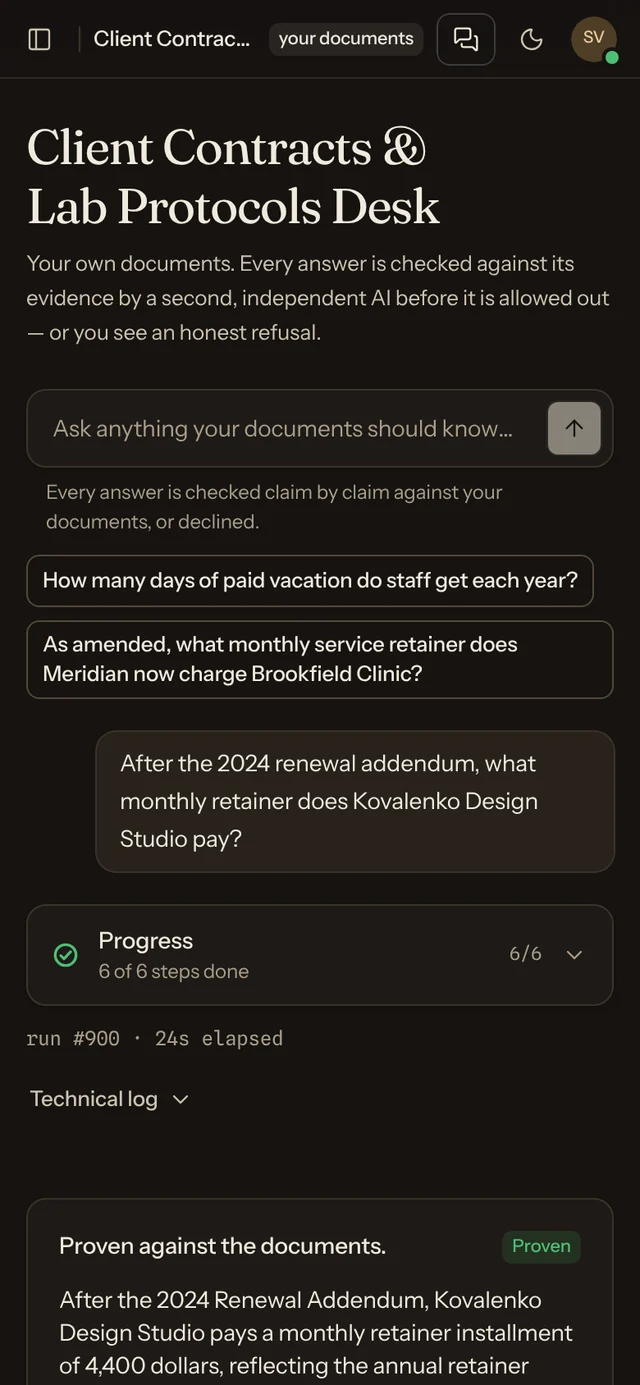
The headline and the serif stayed. Under them now sits a real, proven answer, before anyone signs in.
When the documents can’t prove an answer, the desk still declines, and now shows the passages it weighed right beside the refusal.
Search, filter by kind and state, sort any column. Add files in a dialog; replace or remove one in place.

The original was dark only. The rebuild adds a paper-cream theme in the same style, and remembers which one you chose.


Its own style sits on Beamline’s Mono look: the original palette and its three typefaces.
Build your own stylecites [2]Gold marks the path of proof. Every action is ink.
The live demo runs on sample contracts, in your browser. Nothing you type leaves the tab.
43 Beamline parts in Proofdesk
Part of Beamline UI: polished, editable React components and complete screens for custom applications. Build your own style from any look; tokens, fonts, radii, motion; not only colours.